Sprucing up a PDF in Inkscape
Some of the tools that we used in Module 4 give visual output as raster images, others as vectors. Sometimes, we would like to tweak these outputs to make them more visually appealling, or clearer, or more useful. A program like MS Paint is only useful for dealing with raster images (and then, only in certain kinds of cases). We need a program that can deal with both, and also, lets us edit the image by treating each edit we do as a mostly-transparent layer on top of the image. That way, we can add, rearrange, hide or reveal, our edits to create a composite image. A free program that is immensely useful in this regard is Inkscape. Inkscape is also quite useful in that we can open a PDF file in it, break the visual elements of the PDF into individual layers, and then rearrange/touch up/fix them up to make them more esthetically appealing.
Raster versus Vector
The first thing to know is that graphic images come in two distinct flavours — raster and vector.
Raster images are composed of pixels, such that if you zoom into them, they become a pointilist blur (if you remember Ferris Beuller's Day Off, there's a scene where Cameron stares and stares at a painting, falling into its individual points of colour). Vector images on the other hand are described by mathematical functions, of lines and arcs and areas. No matter how deep you delve into these kinds of images, the image is always sharp — because the zoom is just another function of the mathematics describing the image.
Rasters: blocks of colours
Vectors: descriptions of points and arcs
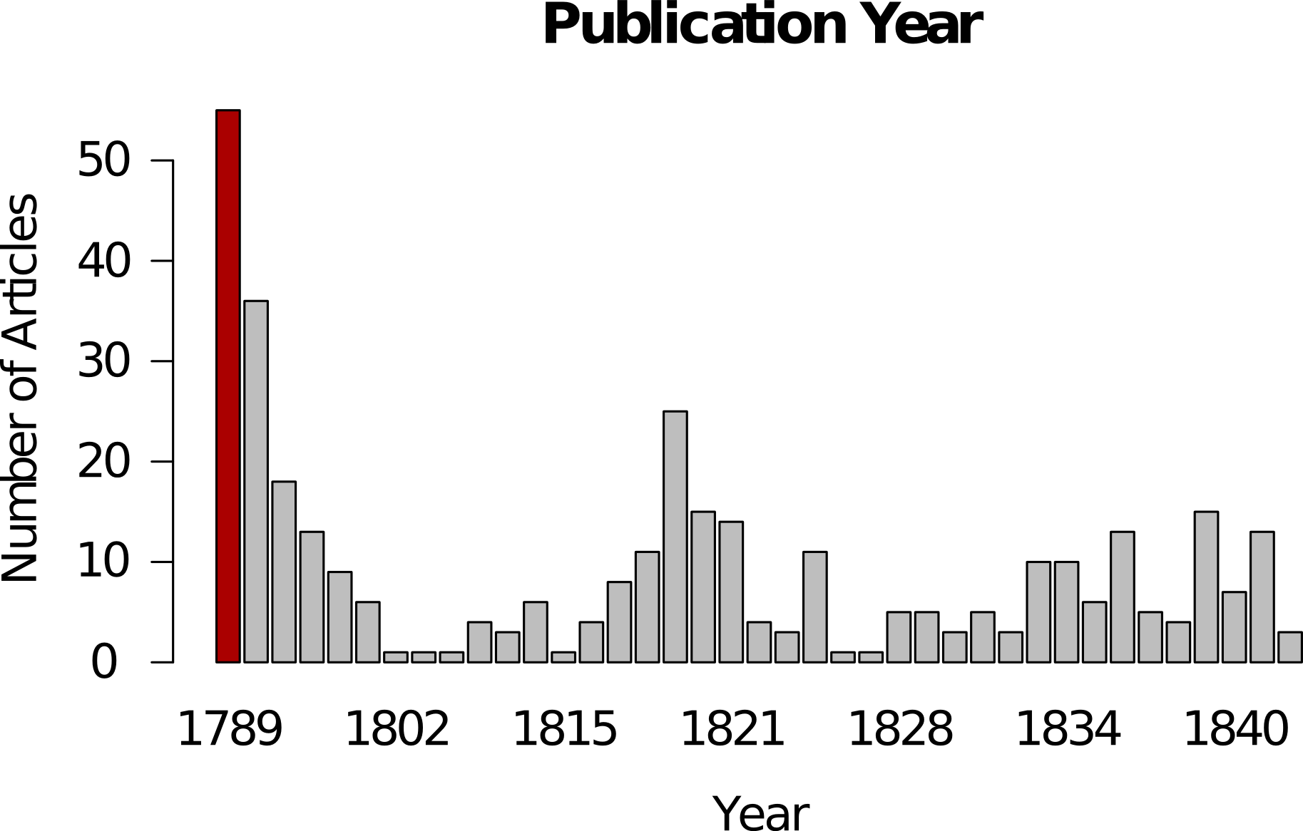
In this first exercise, we will take the plot we generated in Module 4's exercise on topic modeling in R where we made a bar chart showing the number of articles by year. In R we exported that plot as a PDF. In Inkscape, we can import that PDF and 'explode' it so that we can manipulate its parts individually. We are going to take the simple bar chart and make it more legible, more visually appealing, for incorporation on a webpage.
-
Download and install Inkscape .
NB Mac the installation instructions are a bit more complicated for Mac. Pay attention and follow closely!
-
Download the PDF we generated in R called
publication-year.pdf(this downloads the PDF). -
Open that PDF. It's a pretty plain graphic. Right away there are at least two things we could do to make it more visually appealling. We could change the orientation of the characters in the y-axis to make them more legible. We can highlight bars of interest. And we could apply a colour scheme more generally that would make our graphic legible to folks with colour-blindness (see the Going Further section below).
-
Start Inkscape.
-
Click File >> Import >> and then navigate to where you saved
publication-year.pdf. -
Click Ok when you've got it selected.
-
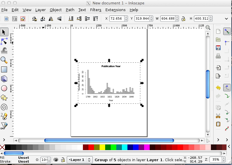
In the next pop-up, just accept the default settings and click 'ok'. Your Inkscape window should now resemble the following:
-
The PDF is now a layer in the new image you are creating in Inkscape. You can save this drawing, with its information about the layers and what is in each one by clicking File >> Save As. (Visit GitHub for my version). 'SVG' stands for 'scalable vector graphic'. (SVG is a kind of text file that describes the complete geometry of your illustration).
-
Do you see the bounding box around the plot? If you grab any of those handles (the double-arrow things), you can make it bigger or smaller on your sheet. To retain the image proportions, hold ctrl + shift as you drag.
-
We can't edit any of the other elements yet — we can't change the colour of the bars, or the fonts of the text. We have to tell Inkscape to 'explode' these elements into their own 'objects'. In the menu bar at top, got to Object >> Ungroup. There are now a series of overlapping bounding boxes around each object.
-
Zoom in (by pressing the
+plus sign on your keyboard) so that you're looking at the numbers of the y-axis. We're going to rotate these by 90 degrees to make them more legible. Select the arrow icon from the toolbar on the left side of the screen. -
Click on the '50'. You'll get a bounding box around it.
-
Click Object >> Rotate 90 CW. The 50 is now rotated! Do the same for the other numbers.
-
Save. (If you double-click on the number, you might trigger the 'text edit' function. If you do that, no problem — you can change the font, change the number... although if you did that, it'd be a bit dishonest, right? Click on the arrow pointer icon in the toolbar again to get out of the text-editing function).
-
Let's imagine, for whatever reason, that you wanted to change one of the bars to a different colour, to highlight its importance to your argument. With the arrow icon, click on one of the bars so that you get the bounding box around it. Then, click on one of the colours from the palette at the bottom. Boom! You've got a newly colourized bar.
-
Save.
-
Add a legend. Write it so that the important message you want your viewer to get is immediately clear. Choose a font from Inkscape's included fonts that supports your message.
-
To export your image so that you can use it in a website or paper, click Edit >> Select All in All Layers. Every element of your image will now have a bounding box around it.
-
Go to File >> Export Bitmap. Never mind the options in the popup; just hit 'Export'. Inkscape will automatically assign your drawing a name with
.png; visit my version on GitHub.
Remember if you want to edit this image again later, hit the 'Save' button to save it as an SVG. The SVG will preserve all your layer information, while the PNG file is the visual representation (the PNG is in fact a raster graphic). Most browsers can handle SVG files, so you could use that in your website; programs like Word seem to be able to handle raster graphics better than they do SVG. You might want to experiment. In any event, every journal has different requirements for image formats. You would export your image to whatever those specifications are.
Going further
In infoheap's tutorial on inkscape, you will learn how to load a custom colour palette. Why might you want to do that? You should be designing your work so that it is as universally accessible as possible. Many folks are colour-blind.
- Use Color Brewer to generate a colour-blind safe palette.
- Then look for the 'GIMP and Inkscape — GIMP color palette for this scheme.'
- Click on that link, and you'll get a text file with the scheme you generated.
- Use that scheme to alter the colours on your plot.